Loading

Word game

Category

UX/UI
Illustration
Game

Year

2020

When I was working as a Designer in Playstack (a videogame publishing company) we had a mobile game that was not performing as expected. It was present both in the App and Google Stores and the reviews were good, but was struggling. The game was initially released in 2018, and by 2020 was due a refresh.

The aim of this project is to find the reasons why it wasn't performing better and offer a solution to it

About the game

GetFact is a word trivia game where you get to reveal the hidden words of each level behind fascinating facts. As you start out you’ll be given a sentence with one or more words undiscovered. The missing words are often too essential and irreplaceable for the full meaning of the given fact and that’s the part that can reduce distinctly your research on the subject. You try to figure out the missing words using the rearranged letters at the bottom of the screen to compose the missing word. Users have as many attempts as they need. The game features over 1,000 interesting facts divided in just the same number of levels.

Research

Pain points

Clunky and uninspiring mechanic
Easy to get stuck on a level
Outdated look

Competitors

The word game market on mobile games is very big, some of the most successful examples of games we that compete against are Wordscapes, Word Lanes, Word Guess and 4 pics 1 word amongst many others.

Ideation

Mechanic
Aesthetic
Interface

Test different mechanics, like swipe letters or word search puzzle

More interesting backgrounds, illustrations

Serif font is adding to the outdated look, change to  a sans serif font
Make more colourful, relaxing and appealing
Add fact categories, and the possibility to jump to the next level and come back to this level in the future

Testing

After some testing the word search puzzle mechanic got the best results, as well as landscape illustration background instead of photography or more abstract images.

Design

Prototype

    • Word search puzzle mechanic, swiping not tapping
    • Calmer new aesthetic: whimsical illustration backgrounds, paired with calm background sounds.
    • Gilroy Sans serif font and narrower spaces for the letter boxes, makes the word look smaller and therefore easier.
    • More rewarding and positive graphics (stars, colourful graphics, encouraging messages)
    • More responsive design (when swiping over the puzzle the selected letters change colour and move slightly with the swipe).

.

Getfact screen

Background illustrations

I had the pleasure to create the first background illustrations too, setting up the style to be continued from now on.

Conclusions

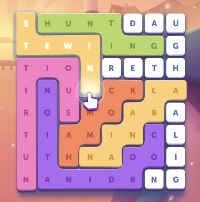
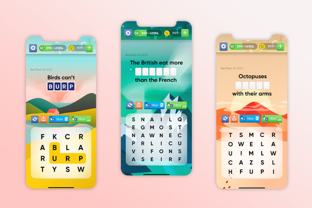
Even if the idea of a word game based on facts is a tried and true classic (think of crosswords), the games’ look and outdated mechanic was making it fall behind on a market full of similar alternatives that just feel better.
This is a recurring challenge on the mobile industry, when UI sometimes gets overlooked. There must be good balance between all the different aspects that make up a game (mechanics, in-game economy, UI/general aesthetic, sound…). As getting just one of them wrong can absolute break the game.
Back To Top